Product Design
Sip 'N Sense
A multisensory straw that tracks liquid by the ounce and communicates the levels through haptics, audio, and light.
Role:
UX Researcher Product Designer
Team:
Jackie Nam Sneha Yalavarti
Timeline:
6 weeks
Tools:
Figma Arduino
Figma Arduino
Figma Arduino

OVERVIEW
OVERVIEW
OVERVIEW
BACKGROUND
Our team was challenged to create a multisensory interface that moves beyond visual dominant design and prioritizes accessibility. Taste is one of the least designed for sensory modalities, and straws are a universally used everyday object. In tandem, we identified a common gap: many people struggle to accurately track liquid intake in real time, whether that’s water, sugar, alcohol, or medication. Most existing solutions rely on visual-only apps that aren’t accessible or intuitive for everyone. This led us to a core question:
What if the straw itself could communicate intake clearly and accessibly through multisensory feedback?
Goals & Success Metrics
Design a multisensory interaction model that communicates liquid intake clearly without relying on vision.
Translate liquid intake into sensory signals that feel intuitive instead of disruptive.
Prototype a straw-centered system that feels familiar, accessible, and easy to adopt.
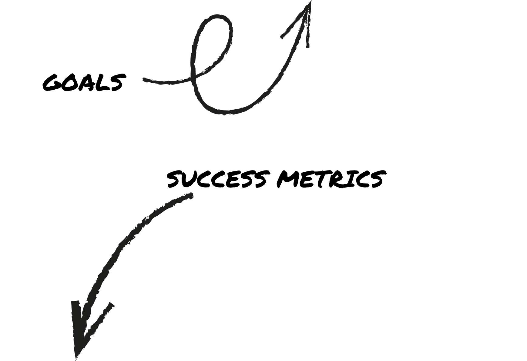
Users can identify intake levels without relying on sight at least 80% of the time during testing.
Interaction feels comfortable and low-effort across 5–7 repeated uses.
The concept sparks clear, repeatable insights during usability tests that validate (or challenge) the sensory feedback patterns we designed.
DIRECT CONTRIBUTIONS
In this multisensory project, I served as a Product Designer and UX Researcher, leading the early stage discovery and competitve analysis. I originated the concept for the multisensory straw and its companion app, guided our user research process, and wrote the grant application that funded our project. My teammates focused on engineering and fabrication, exploring the technical feasibility of the design. Each person played an essential role, and our strengths came together to create a well-rounded final result.
RESEARCH

Before designing anything, I needed to understand how people track liquid intake today, and which sensory cues they naturally notice or ignore. Our research combined early discovery work with hands-on testing to pinpoint opportunities and barriers.
Before designing anything, I needed to understand how people track liquid intake today, and which sensory cues they naturally notice or ignore. Our research combined early discovery work with hands-on testing to pinpoint opportunities and barriers.
Before designing anything, I needed to understand how people track liquid intake today, and which sensory cues they naturally notice or ignore. Our research combined early discovery work with hands-on testing to pinpoint opportunities and barriers.

User interviews helped us surface how people estimate hydration day to day, what cues they trust, and where their current strategies fall short. We then observed participants interacting with a lo-fi straw prototype to uncover moments of intuition, confusion, and friction. Finally, we ran A/B tests comparing three sensory cues (sound, vibration, and light) to see which signals users noticed, preferred, and could interpret with the least effort. These insights directly shaped our multisensory interaction model.
EARLY VALIDATION
Across four cue conditions, participants sipped toward a 2oz target zone—attempting to estimate their water intake. Accuracy improved in every non-visual modality compared to the baseline. Vibration cues aligned participants most closely with the 2oz goal, producing the strongest consistency. Confidence also rose: in rounds with sensory cues, all five participants reported feeling capable of estimating intake, compared to just two out of five during the sight-only condition.
SYNTHESIZE
RESEARCH
Problem :
RESEARCH
SYNTHESIZE
RESEARCH
AFFINITY MAPPING

Problem :
We synthesized interview data by sensory preferences and tracking habits. Participants responded most positively to haptic feedback, with audio cues ranking second for clarity and comfort. These findings supported our early design explorations, such as dividing the straw into three haptic zones or allowing users to switch between feedback types. Light-based cues consistently ranked lowest in both comfort and clarity, leading us to flag them for future reconsideration. Similarly, since most users tracked hydration via bottles, we ensured our prototype could evolve toward bottle compatibility and alternate sensing methods.
To communicate key findings from user interviews and secondary research, I translated recurring insights into user personas. These helped clarify user needs and shape our design direction.


Problem :
Problem :
Problem :
Problem :
USER PERSONAS
TASK FLOW
To map out the full user experience, I created a task flow detailing setup, usage, and tracking for the smart straw. Since the app served a secondary, optional role, I focused primarily on the physical product flow.
IDEATE
We moved rapidly from concept to construction, exploring lo-fi prototypes and layout diagrams to test interaction models and hardware feasibility.
EARLY CONCEPT SKETCHES


LO-FI PROTOYPE

Our earliest visual exploration helped us outline possible forms and feedback methods for the straw-based system.
FUNCTIONAL DIAGRAMS


We began exploring a high-fidelity physical prototype using a cup, sensors, a straw and a feedback box. One of our key user personas is blind, and two of our guest testers were low-vision, so it was crucial that we explored tactile feedback early in our process. While our original concept centered on a smart straw, this early prototype with a tactile box allowed us to validate core feedback mechanisms—buzz, sound, and light—before refining the physical form.
USER INTERFACE
We mocked up a hi-fi prototype in Figma of the tracking screen to accompany the physical prototype.
FINAL PROTOTYPE
FINAL PROTOTYPE
Our high-fidelity build included real-time tracking and feedback using sound, vibration, and light. The final experience captured both our interaction goals and technical feasibility.
IMPLEMENTATION

We tested our working prototype with users across a wide range of sensory needs and hydration habits.
Each participant was able to operate the device successfully after a brief demo.
Low vision users in particular found the experience engaging and intuitive, reinforcing our emphasis on tactile feedback.
Testing affirmed that the system’s multisensory signals were distinguishable and actionable, even in the absence of visual input.
IMPROVEMENT OPPORTUNITIES
While the prototype worked as intended, a few key areas emerged for future development:
• Miniaturization: Smaller sensors would allow us to better embed the system in our straw, reducing bulk and improving portability.
• App Expansion: While we deprioritized the app for this version, a future build could support tracking, goal-setting, and feedback customization.
• Hybrid Design: The success of our tactile box prototype opened new design space—we’re now exploring both a smart straw and a countertop “hydration hub” to support a broader range of users.
LESSONS LEARNED
This project deepened my belief that accessibility drives innovation. By designing with specific needs in mind—from vision impairment to limited dexterity—we arrived at interactions that felt more universal. I found myself guided by the Curb Cut Effect: the principle that solutions created for one group often benefit everyone. Designing with empathy led us not only to stronger feedback systems, but to a more delightful experience overall.
More Projects

Product Design
Sip 'N Sense
A multisensory straw that tracks liquid by the ounce and communicates the levels through haptics, audio, and light.
Role:
UX Researcher Product Designer
Team:
Jackie Nam Sneha Yalavarti
Timeline:
6 weeks
Tools:
Figma Arduino
Figma Arduino
Figma Arduino
OVERVIEW
OVERVIEW
OVERVIEW
BACKGROUND
Our team was challenged to create a multisensory interface that moves beyond visual dominant design and prioritizes accessibility. Taste is one of the least designed for sensory modalities, and straws are a universally used everyday object. In tandem, we identified a common gap: many people struggle to accurately track liquid intake in real time, whether that’s water, sugar, alcohol, or medication. Most existing solutions rely on visual-only apps that aren’t accessible or intuitive for everyone. This led us to a core question:
What if the straw itself could communicate intake clearly and accessibly through multisensory feedback?
goals & success metrics
Design a multisensory interaction model that communicates liquid intake clearly without relying on vision.
Translate liquid intake into sensory signals that feel intuitive instead of disruptive.
Prototype a straw-centered system that feels familiar, accessible, and easy to adopt.
Users can identify intake levels without relying on sight at least 80% of the time during testing.
Interaction feels comfortable and low-effort across 5–7 repeated uses.
The concept sparks clear, repeatable insights during usability tests that validate (or challenge) the sensory feedback patterns we designed.
DIRECT CONTRIBUTIONS
In this multisensory project, I served as a Product Designer and UX Researcher, leading the early stage discovery and competitve analysis. I originated the concept for the multisensory straw and its companion app, guided our user research process, and wrote the grant application that funded our project. My teammates focused on engineering and fabrication, exploring the technical feasibility of the design. Each person played an essential role, and our strengths came together to create a well-rounded final result.
RESEARCH
Before designing anything, I needed to understand how people track liquid intake today, and which sensory cues they naturally notice or ignore. Our research combined early discovery work with hands-on testing to pinpoint opportunities and barriers.
User interviews helped us surface how people estimate hydration day to day, what cues they trust, and where their current strategies fall short. We then observed participants interacting with a lo-fi straw prototype to uncover moments of intuition, confusion, and friction. Finally, we ran A/B tests comparing three sensory cues (sound, vibration, and light) to see which signals users noticed, preferred, and could interpret with the least effort. These insights directly shaped our multisensory interaction model.
EARLY VALIDATION
Across four cue conditions, participants sipped toward a 2oz target zone—attempting to estimate their water intake. Accuracy improved in every non-visual modality compared to the baseline. Vibration cues aligned participants most closely with the 2oz goal, producing the strongest consistency. Confidence also rose: in rounds with sensory cues, all five participants reported feeling capable of estimating intake, compared to just two out of five during the sight-only condition.
SYNTHESIZE
AFFINITY MAPPING
We synthesized interview data by sensory preferences and tracking habits. Participants responded most positively to haptic feedback, with audio cues ranking second for clarity and comfort. These findings supported our early design explorations, such as dividing the straw into three haptic zones or allowing users to switch between feedback types. Light-based cues consistently ranked lowest in both comfort and clarity, leading us to flag them for future reconsideration. Similarly, since most users tracked hydration via bottles, we ensured our prototype could evolve toward bottle compatibility and alternate sensing methods.
To communicate key findings from user interviews and secondary research, I translated recurring insights into user personas. These helped clarify user needs and shape our design direction.
USER PERSONAS
TASK FLOW
To map out the full user experience, I created a task flow detailing setup, usage, and tracking for the smart straw. Since the app served a secondary, optional role, I focused primarily on the physical product flow.
Goals & Success Metrics
We moved rapidly from concept to construction, exploring lo-fi prototypes and layout diagrams to test interaction models and hardware feasibility.
EARLY CONCEPT SKETCHES
LO-FI PROTOYPE
Our earliest visual exploration helped us outline possible forms and feedback methods for the straw-based system.
FUNCTIONAL DIAGRAMS
We began exploring a high-fidelity physical prototype using a cup, sensors, a straw and a feedback box. One of our key user personas is blind, and two of our guest testers were low-vision, so it was crucial that we explored tactile feedback early in our process. While our original concept centered on a smart straw, this early prototype with a tactile box allowed us to validate core feedback mechanisms—buzz, sound, and light—before refining the physical form.
USER INTERFACE
We mocked up a hi-fi prototype in Figma of the tracking screen to accompany the physical prototype.
FINAL PROTOTYPE
FINAL PROTOTYPE
Our high-fidelity build included real-time tracking and feedback using sound, vibration, and light. The final experience captured both our interaction goals and technical feasibility.
IMPLEMENTATION & VALIDATION
We tested our working prototype with users across a wide range of sensory needs and hydration habits.
Each participant was able to operate the device successfully after a brief demo.
Low vision users in particular found the experience engaging and intuitive, reinforcing our emphasis on tactile feedback.
Testing affirmed that the system’s multisensory signals were distinguishable and actionable, even in the absence of visual input.
IMPROVEMENT OPPORTUNITIES
While the prototype worked as intended, a few key areas emerged for future development:
• Miniaturization: Smaller sensors would allow us to better embed the system in our straw, reducing bulk and improving portability.
• App Expansion: While we deprioritized the app for this version, a future build could support tracking, goal-setting, and feedback customization.
• Hybrid Design: The success of our tactile box prototype opened new design space—we’re now exploring both a smart straw and a countertop “hydration hub” to support a broader range of users.
LESSONS LEARNED
LESSONS LEARNED
This project deepened my belief that accessibility drives innovation. By designing with specific needs in mind—from vision impairment to limited dexterity—we arrived at interactions that felt more universal. I found myself guided by the Curb Cut Effect: the principle that solutions created for one group often benefit everyone. Designing with empathy led us not only to stronger feedback systems, but to a more delightful experience overall.
More Projects
Role:
UX Researcher Product Designer
Team:
Jackie Nam Sneha Yalavarti
Client :
Figma Arduino
Timeline:
6 weeks
Tools:
Figma Arduino
Product Design
Sip 'N Sense
A multisensory straw that tracks liquid by the ounce and communicates the levels through haptics, audio, and light.
Role:
UX Researcher Product Designer
Team:
Jackie Nam Sneha Yalavarti
Timeline:
6 weeks
Tools:
Figma Arduino
Figma Arduino
Figma Arduino
OVERVIEW
OVERVIEW
OVERVIEW
BACKGROUND
Our team was challenged to create a multisensory interface that moves beyond visual dominant design and prioritizes accessibility. Taste is one of the least designed for sensory modalities, and straws are a universally used everyday object. In tandem, we identified a common gap: many people struggle to accurately track liquid intake in real time, whether that’s water, sugar, alcohol, or medication. Most existing solutions rely on visual-only apps that aren’t accessible or intuitive for everyone. This led us to a core question:
What if the straw itself could communicate intake clearly and accessibly through multisensory feedback?
Goals & Success Metrics
Design a multisensory interaction model that communicates liquid intake clearly without relying on vision.
Translate liquid intake into sensory signals that feel intuitive instead of disruptive.
Prototype a straw-centered system that feels familiar, accessible, and easy to adopt.
Users can identify intake levels without relying on sight at least 80% of the time during testing.
Interaction feels comfortable and low-effort across 5–7 repeated uses.
The concept sparks clear, repeatable insights during usability tests that validate (or challenge) the sensory feedback patterns we designed.
DIRECT CONTRIBUTIONS
In this multisensory project, I served as a Product Designer and UX Researcher, leading the early stage discovery and competitve analysis. I originated the concept for the multisensory straw and its companion app, guided our user research process, and wrote the grant application that funded our project. My teammates focused on engineering and fabrication, exploring the technical feasibility of the design. Each person played an essential role, and our strengths came together to create a well-rounded final result.
RESEARCH
Before designing anything, I needed to understand how people track liquid intake today, and which sensory cues they naturally notice or ignore. Our research combined early discovery work with hands-on testing to pinpoint opportunities and barriers.
Before designing anything, I needed to understand how people track liquid intake today, and which sensory cues they naturally notice or ignore. Our research combined early discovery work with hands-on testing to pinpoint opportunities and barriers.
Before designing anything, I needed to understand how people track liquid intake today, and which sensory cues they naturally notice or ignore. Our research combined early discovery work with hands-on testing to pinpoint opportunities and barriers.
User interviews helped us surface how people estimate hydration day to day, what cues they trust, and where their current strategies fall short. We then observed participants interacting with a lo-fi straw prototype to uncover moments of intuition, confusion, and friction. Finally, we ran A/B tests comparing three sensory cues (sound, vibration, and light) to see which signals users noticed, preferred, and could interpret with the least effort. These insights directly shaped our multisensory interaction model.
EARLY VALIDATION
Across four cue conditions, participants sipped toward a 2oz target zone—attempting to estimate their water intake. Accuracy improved in every non-visual modality compared to the baseline. Vibration cues aligned participants most closely with the 2oz goal, producing the strongest consistency. Confidence also rose: in rounds with sensory cues, all five participants reported feeling capable of estimating intake, compared to just two out of five during the sight-only condition.
SYNTHESIZE
RESEARCH
Problem :
RESEARCH
SYNTHESIZE
RESEARCH
AFFINITY MAPPING
Problem :
We synthesized interview data by sensory preferences and tracking habits. Participants responded most positively to haptic feedback, with audio cues ranking second for clarity and comfort. These findings supported our early design explorations, such as dividing the straw into three haptic zones or allowing users to switch between feedback types. Light-based cues consistently ranked lowest in both comfort and clarity, leading us to flag them for future reconsideration. Similarly, since most users tracked hydration via bottles, we ensured our prototype could evolve toward bottle compatibility and alternate sensing methods.
To communicate key findings from user interviews and secondary research, I translated recurring insights into user personas. These helped clarify user needs and shape our design direction.
Problem :
Problem :
Problem :
Problem :
USER PERSONAS
TASK FLOW
To map out the full user experience, I created a task flow detailing setup, usage, and tracking for the smart straw. Since the app served a secondary, optional role, I focused primarily on the physical product flow.
IDEATE
We moved rapidly from concept to construction, exploring lo-fi prototypes and layout diagrams to test interaction models and hardware feasibility.
EARLY CONCEPT SKETCHES
LO-FI PROTOYPE
Our earliest visual exploration helped us outline possible forms and feedback methods for the straw-based system.
FUNCTIONAL DIAGRAMS
We began exploring a high-fidelity physical prototype using a cup, sensors, a straw and a feedback box. One of our key user personas is blind, and two of our guest testers were low-vision, so it was crucial that we explored tactile feedback early in our process. While our original concept centered on a smart straw, this early prototype with a tactile box allowed us to validate core feedback mechanisms—buzz, sound, and light—before refining the physical form.
USER INTERFACE
We mocked up a hi-fi prototype in Figma of the tracking screen to accompany the physical prototype.
FINAL PROTOTYPE
FINAL PROTOTYPE
Our high-fidelity build included real-time tracking and feedback using sound, vibration, and light. The final experience captured both our interaction goals and technical feasibility.
IMPLEMENTATION
We tested our working prototype with users across a wide range of sensory needs and hydration habits.
Each participant was able to operate the device successfully after a brief demo.
Low vision users in particular found the experience engaging and intuitive, reinforcing our emphasis on tactile feedback.
Testing affirmed that the system’s multisensory signals were distinguishable and actionable, even in the absence of visual input.
IMPROVEMENT OPPORTUNITIES
While the prototype worked as intended, a few key areas emerged for future development:
• Miniaturization: Smaller sensors would allow us to better embed the system in our straw, reducing bulk and improving portability.
• App Expansion: While we deprioritized the app for this version, a future build could support tracking, goal-setting, and feedback customization.
• Hybrid Design: The success of our tactile box prototype opened new design space—we’re now exploring both a smart straw and a countertop “hydration hub” to support a broader range of users.
LESSONS LEARNED
This project deepened my belief that accessibility drives innovation. By designing with specific needs in mind—from vision impairment to limited dexterity—we arrived at interactions that felt more universal. I found myself guided by the Curb Cut Effect: the principle that solutions created for one group often benefit everyone. Designing with empathy led us not only to stronger feedback systems, but to a more delightful experience overall.
More Projects
Product Design
Sip 'N Sense
A multisensory straw that tracks liquid by the ounce and communicates the levels through haptics, audio, and light.
Role:
UX Researcher Product Designer
Team:
Jackie Nam Sneha Yalavarti
Timeline:
6 weeks
Tools:
Figma Arduino
Figma Arduino
Figma Arduino
OVERVIEW
OVERVIEW
OVERVIEW
BACKGROUND
Our team was challenged to create a multisensory interface that moves beyond visual dominant design and prioritizes accessibility. Taste is one of the least designed for sensory modalities, and straws are a universally used everyday object. In tandem, we identified a common gap: many people struggle to accurately track liquid intake in real time, whether that’s water, sugar, alcohol, or medication. Most existing solutions rely on visual-only apps that aren’t accessible or intuitive for everyone. This led us to a core question:
What if the straw itself could communicate intake clearly and accessibly through multisensory feedback?
goals & success metrics
Design a multisensory interaction model that communicates liquid intake clearly without relying on vision.
Translate liquid intake into sensory signals that feel intuitive instead of disruptive.
Prototype a straw-centered system that feels familiar, accessible, and easy to adopt.
Users can identify intake levels without relying on sight at least 80% of the time during testing.
Interaction feels comfortable and low-effort across 5–7 repeated uses.
The concept sparks clear, repeatable insights during usability tests that validate (or challenge) the sensory feedback patterns we designed.
DIRECT CONTRIBUTIONS
In this multisensory project, I served as a Product Designer and UX Researcher, leading the early stage discovery and competitve analysis. I originated the concept for the multisensory straw and its companion app, guided our user research process, and wrote the grant application that funded our project. My teammates focused on engineering and fabrication, exploring the technical feasibility of the design. Each person played an essential role, and our strengths came together to create a well-rounded final result.
RESEARCH
Before designing anything, I needed to understand how people track liquid intake today, and which sensory cues they naturally notice or ignore. Our research combined early discovery work with hands-on testing to pinpoint opportunities and barriers.
User interviews helped us surface how people estimate hydration day to day, what cues they trust, and where their current strategies fall short. We then observed participants interacting with a lo-fi straw prototype to uncover moments of intuition, confusion, and friction. Finally, we ran A/B tests comparing three sensory cues (sound, vibration, and light) to see which signals users noticed, preferred, and could interpret with the least effort. These insights directly shaped our multisensory interaction model.
EARLY VALIDATION
Across four cue conditions, participants sipped toward a 2oz target zone—attempting to estimate their water intake. Accuracy improved in every non-visual modality compared to the baseline. Vibration cues aligned participants most closely with the 2oz goal, producing the strongest consistency. Confidence also rose: in rounds with sensory cues, all five participants reported feeling capable of estimating intake, compared to just two out of five during the sight-only condition.
SYNTHESIZE
AFFINITY MAPPING
We synthesized interview data by sensory preferences and tracking habits. Participants responded most positively to haptic feedback, with audio cues ranking second for clarity and comfort. These findings supported our early design explorations, such as dividing the straw into three haptic zones or allowing users to switch between feedback types. Light-based cues consistently ranked lowest in both comfort and clarity, leading us to flag them for future reconsideration. Similarly, since most users tracked hydration via bottles, we ensured our prototype could evolve toward bottle compatibility and alternate sensing methods.
To communicate key findings from user interviews and secondary research, I translated recurring insights into user personas. These helped clarify user needs and shape our design direction.
USER PERSONAS
TASK FLOW
To map out the full user experience, I created a task flow detailing setup, usage, and tracking for the smart straw. Since the app served a secondary, optional role, I focused primarily on the physical product flow.
Goals & Success Metrics
We moved rapidly from concept to construction, exploring lo-fi prototypes and layout diagrams to test interaction models and hardware feasibility.
EARLY CONCEPT SKETCHES
LO-FI PROTOYPE
Our earliest visual exploration helped us outline possible forms and feedback methods for the straw-based system.
FUNCTIONAL DIAGRAMS
We began exploring a high-fidelity physical prototype using a cup, sensors, a straw and a feedback box. One of our key user personas is blind, and two of our guest testers were low-vision, so it was crucial that we explored tactile feedback early in our process. While our original concept centered on a smart straw, this early prototype with a tactile box allowed us to validate core feedback mechanisms—buzz, sound, and light—before refining the physical form.
USER INTERFACE
We mocked up a hi-fi prototype in Figma of the tracking screen to accompany the physical prototype.
FINAL PROTOTYPE
FINAL PROTOTYPE
Our high-fidelity build included real-time tracking and feedback using sound, vibration, and light. The final experience captured both our interaction goals and technical feasibility.
IMPLEMENTATION & VALIDATION
We tested our working prototype with users across a wide range of sensory needs and hydration habits.
Each participant was able to operate the device successfully after a brief demo.
Low vision users in particular found the experience engaging and intuitive, reinforcing our emphasis on tactile feedback.
Testing affirmed that the system’s multisensory signals were distinguishable and actionable, even in the absence of visual input.
IMPROVEMENT OPPORTUNITIES
While the prototype worked as intended, a few key areas emerged for future development:
• Miniaturization: Smaller sensors would allow us to better embed the system in our straw, reducing bulk and improving portability.
• App Expansion: While we deprioritized the app for this version, a future build could support tracking, goal-setting, and feedback customization.
• Hybrid Design: The success of our tactile box prototype opened new design space—we’re now exploring both a smart straw and a countertop “hydration hub” to support a broader range of users.
LESSONS LEARNED
LESSONS LEARNED
This project deepened my belief that accessibility drives innovation. By designing with specific needs in mind—from vision impairment to limited dexterity—we arrived at interactions that felt more universal. I found myself guided by the Curb Cut Effect: the principle that solutions created for one group often benefit everyone. Designing with empathy led us not only to stronger feedback systems, but to a more delightful experience overall.
More Projects
Role:
UX Researcher Product Designer
Team:
Jackie Nam Sneha Yalavarti
Client :
Figma Arduino
Timeline:
6 weeks
Tools:
Figma Arduino